A Skink's Tale
Poster design process
 Hi Everyone!
With our public debut at the November student edition of Let's Break Games just a week away, Megan and I have been busy polishing marketing art.
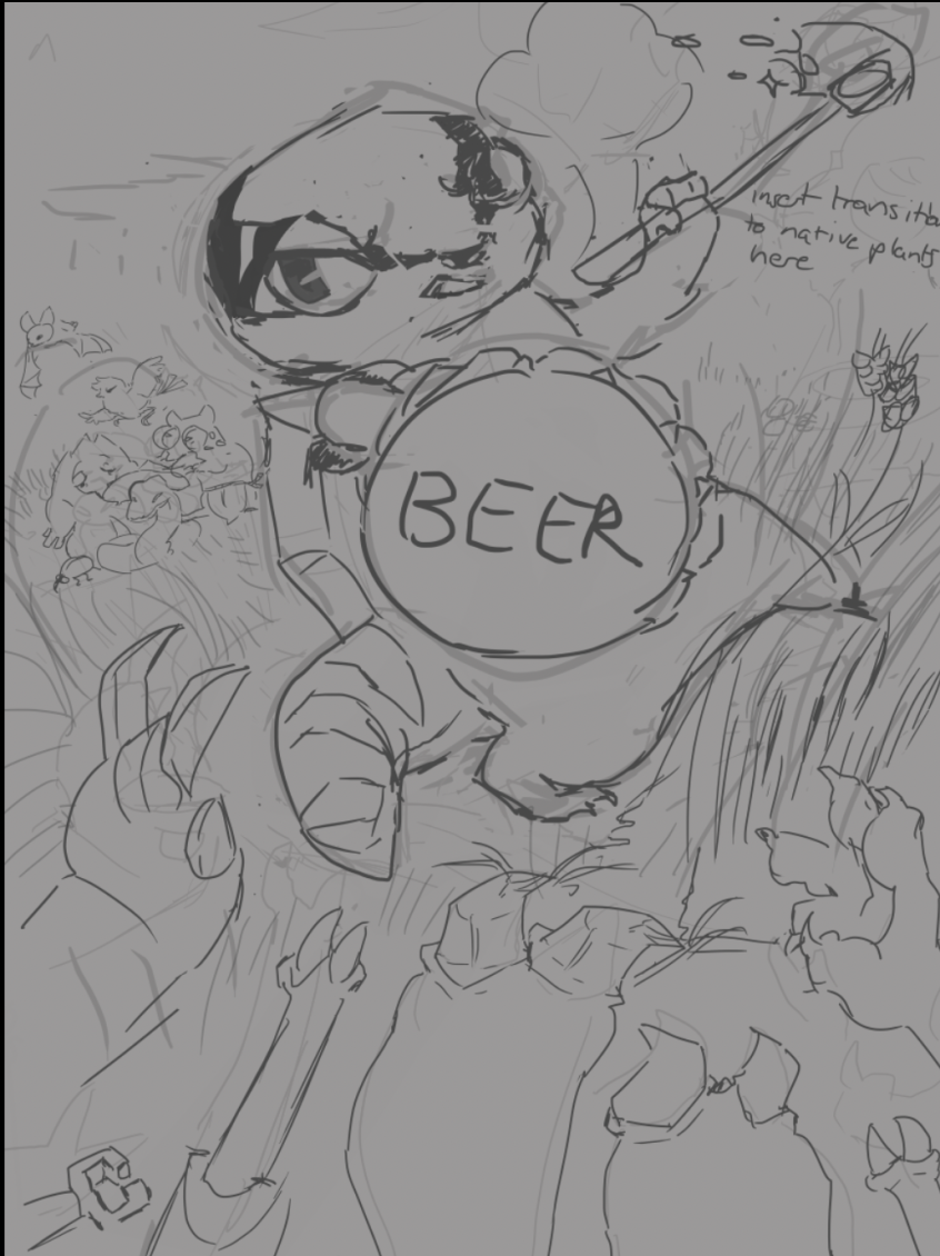
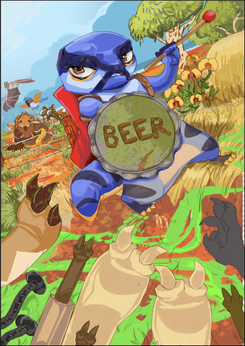
Our poster started with rough composing, deciding how to pose and include everything important to A Skink's Tale, whilst still leaving enough room for passers-by to want more. We wanted a sketchy style with little blending, the sharper outlines are more reflective on the in-game pixel art and lend it a whimsier style if you ask me:)
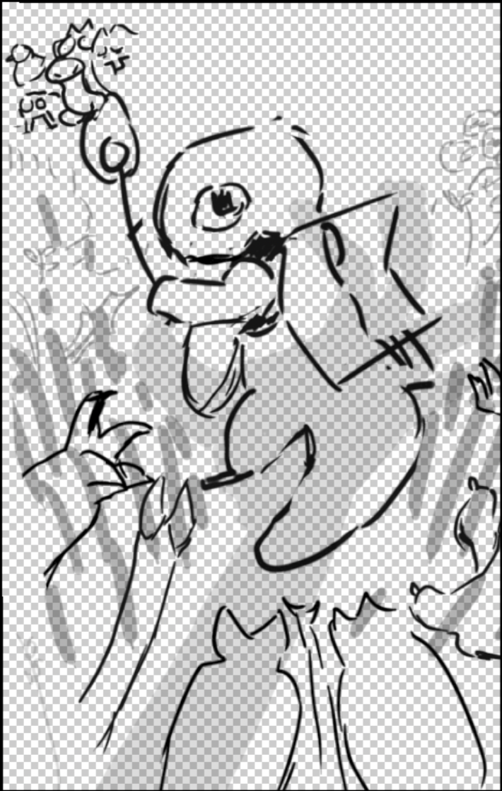
After checking in with everyone for approval, I solidified pose and positioning before collaborating with Megan, our second artist, who wanted to collaborate on the poster and chose to clean the line art. Brave to leave the rendering to me, honestly, but I love the challenge (I am not the most confident in my illustration abilities!)
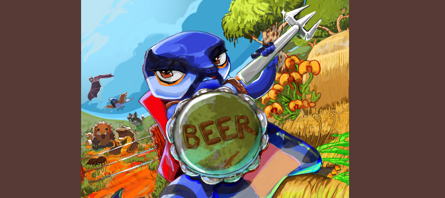
Finally, I start with colour! First, the flats, I really had to trust the process here; he looked so wonky in the eyes.
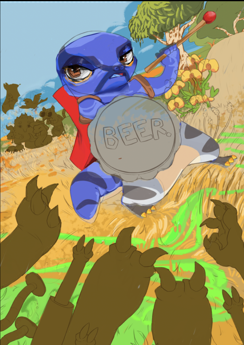
Then render out textures and depth, the skink is no longer ugly! Yay!
We decided to change the match out for the fork!
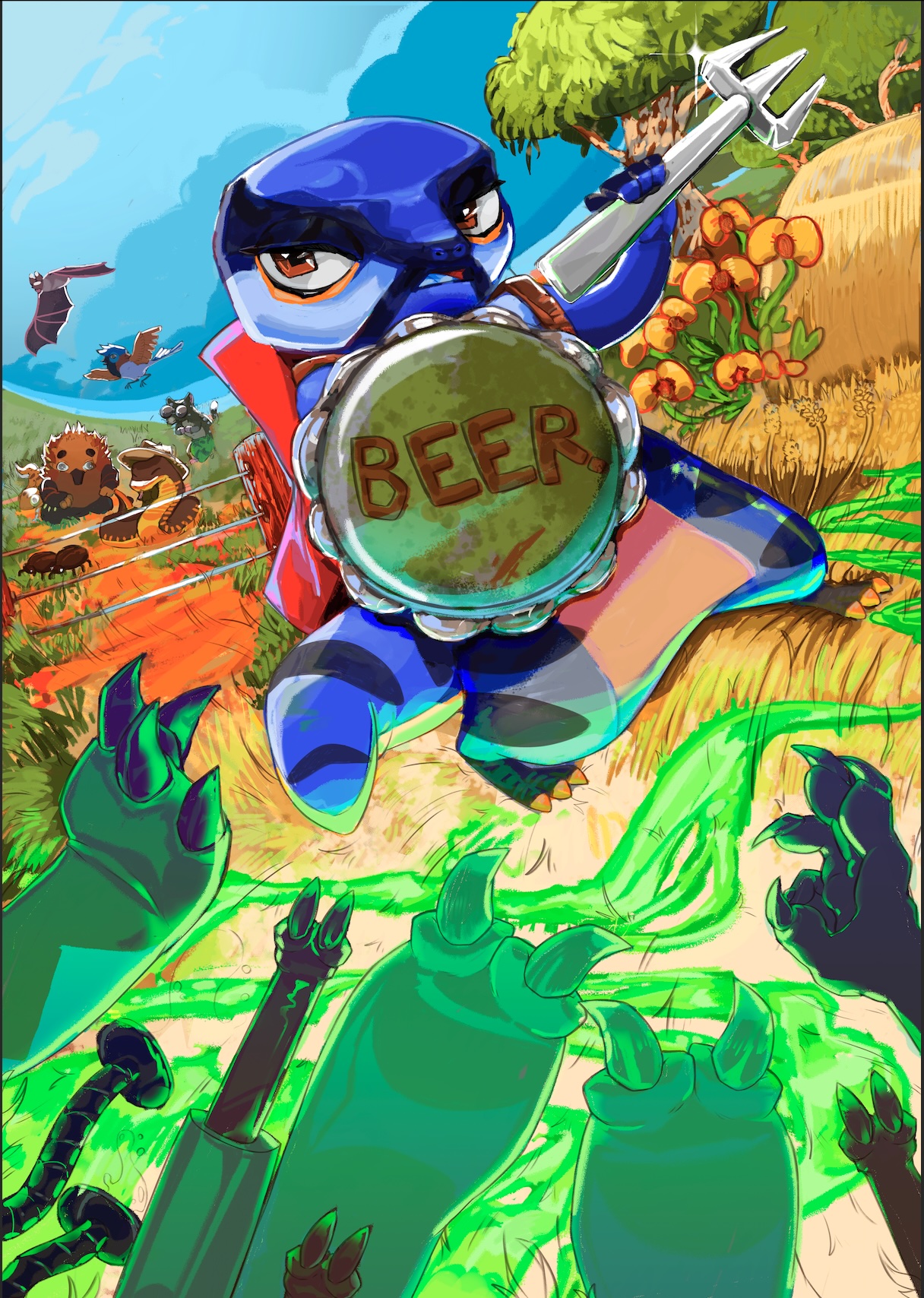
Final touches applied by Megan, we were having issues with the colours as they needed to be CMYK friendly, and unfortunately, the original green for the pesticide would come out looking muddy (and strangely blue..)
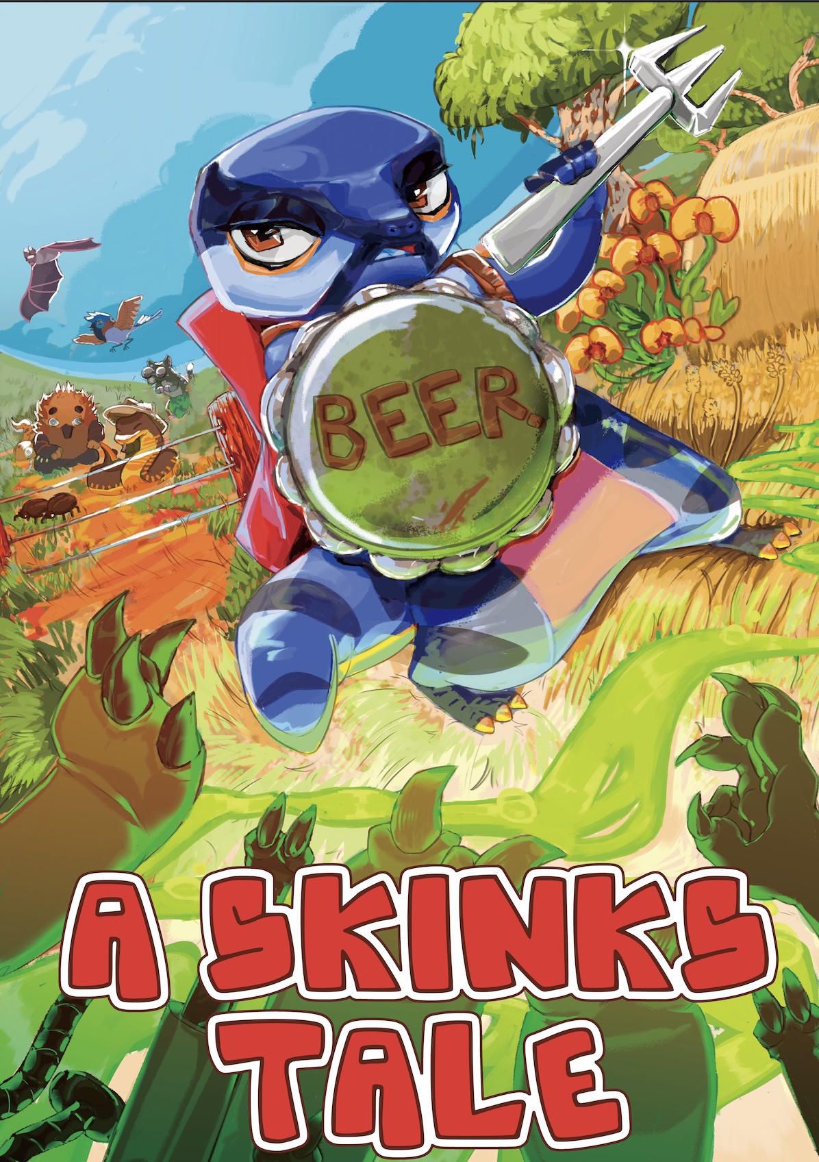
I'm not as happy as I could be with this poster. It could have benefited from an extra day's work to detail out the smaller things and make the colours pop more. I've learnt a lot from this already and still enjoyed the process!
Signed Chip Castelnau, Art and Design Lead.
Leave a comment
Log in with itch.io to leave a comment.